
They say you shouldn’t judge a book by its cover, which I
tend to believe in when it comes to judging people by their exterior,
but with books themselves I will be the first to (shamefully) admit that
the cover of a book is the first thing to draw me into it… Then I turn
over the cover and read the blurb and if the storyline intrigues me, I’m
in. I’m fairly simple that way.
Needless to say, it was very important to me to create a cover that was appealing enough to draw people in, to capture a persons interest and give them a small glimpse of the story through a freeze frame. I’d love to say I am clever enough to do that myself but unfortunately I wasn’t blessed with the ability of taking what’s in my head and representing that in an image on paper.
In walks Kristen Caruana, an artist that just happens to get me and understand what’s going on in my head… And she has the ability to capture it in an amazing way.
I sent her excerpts, we spoke in length about what I saw as a cover and what I was trying to portray and gave her artistic license to fill in the blanks. However, we worked together throughout the entire process, she updated me and asked my opinions, making sure I was completely happy with the way it was progressing.
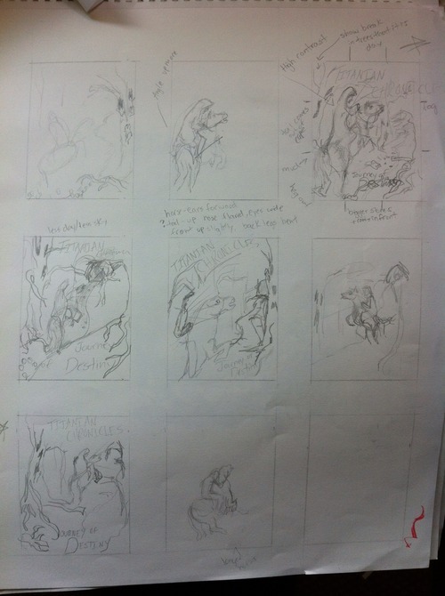
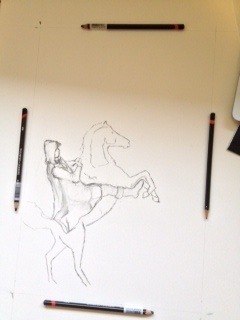
We started out with just some thumbnail sketches… Rough scribbles that looked like something my kids could reproduce, but which enabled me to see my options as far as layout.
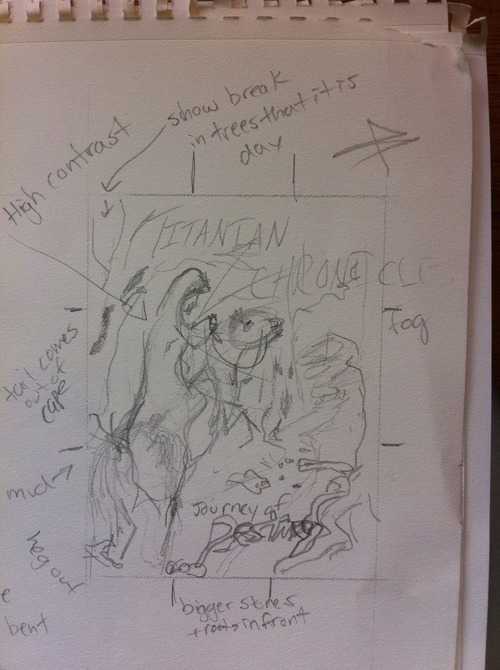
Since I was torn between what I had first envisaged and another option she had presented to me she took away the pictures I liked and recreated them as large, more detailed examples. While I did, once again, like them both, I was much more drawn to the picture with the rider right up front in the foreground… And as I said the cover needed to draw me in.
I could tell there and then that the cover was going to be all that I had hoped for and more.
Decision made, the fun could begin.
We studied horses to find the right look. I wanted to see the horse on his hind legs with a look of fear in his face.
I was particular about the positioning of the rider also, Kristen’s husband was a great sport and posed numerous times riding a chair in the living room.
As the horse started taking shape, Kristen started working on the twisted, gnarled trees that surrounded the scene. She also started to play with the title wording.
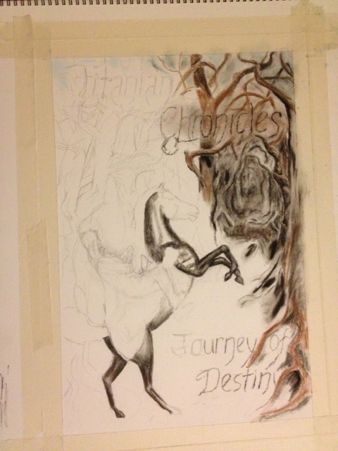
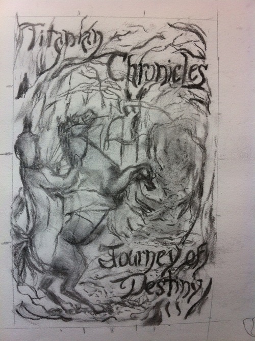
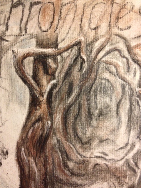
With a focus on adding character to one of the trees, Kristen worked hard at shading the tree in just the right way to make it appear a little creepy and as if it had some life of it’s own.
After a lot of hard work on the title and the colouring coming together, the riders cape started to take shape. However, Kristen being the particular artist herself, played back and forward with certain details and aspects… I added my two bits from time to time but I was so excited to see my scene appearing before my eyes… So surreal.
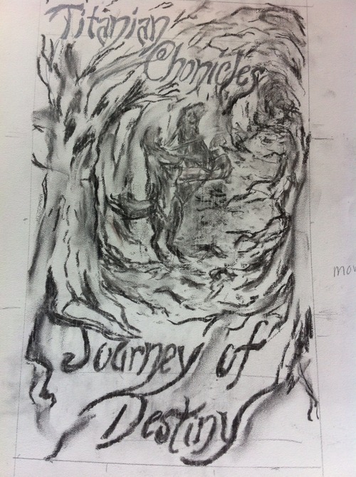
Once the rest of the cover was in place, Kristen focused her attention on finishing the horse and rider… During this time I saw much change take place… I already thought it was good but it just kept getting better and surprising me.

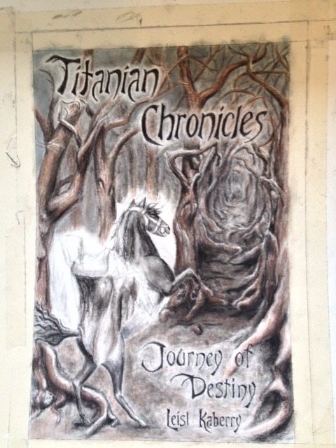
After a couple of months work we were almost there… The rider finally fleshed out, the cape having definition and blue light emanating from the rock around his neck… Also a mist swarmed the trees. A couple of details to work on but I was pretty satisfied at this point. If she had of told this was the best she could do, I probably would have accepted it… So glad I didn’t have to though.
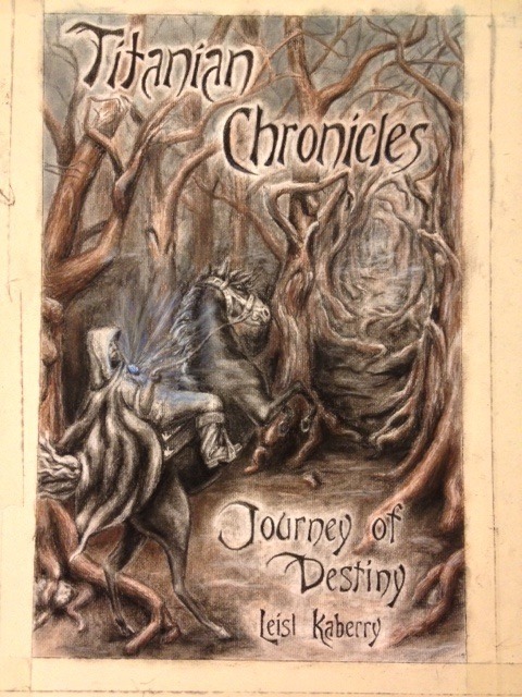
After some small changes and additions… Mud splatters on the cape, a change of horse’s tail, more expression in the horse’s eye and a deeper blue to the light… I was ready to walk out the door with it.
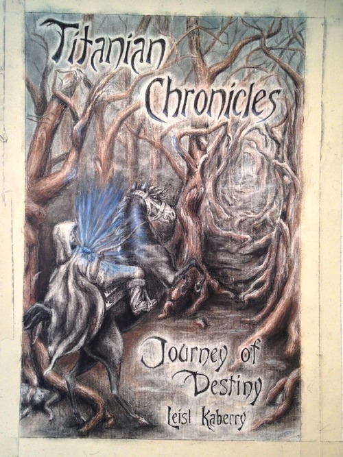
Kristen sprayed it to protect the colour and the whole picture darkened considerably… The colour change was perfect, I couldn’t be happier… Time to photograph, frame and put up on the wall.
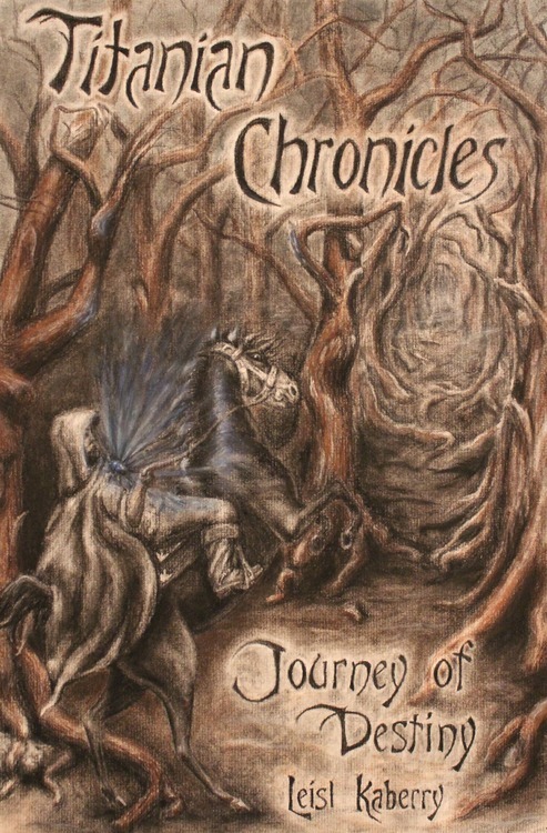
I love my cover. Cheers Kristen!
No comments:
Post a Comment